|
 |
| Rank | Posts | Team |
| International Star | 4470 | No
Team
Selected |
| Joined | Service | Reputation |
| Jan 2013 | 12 years | |
| Online | Last Post | Last Page |
| Oct 2024 | Oct 2024 | LINK |
| Milestone Posts |
|
| Milestone Years |
|
|
| Location |
|
| Signature |
|
TO BE FIXED |
|
| Quote ="post"Can someone who is good on a computer rig up a similar badge but instead of the White Walker, put the Castle with crown on top (Yes Ive seen that one rigged up already) but also the lions either side and the king on top etc.'"
So basically, the current crest? |
|
|
| Rank | Posts | Team |
| International Star | 4470 | No
Team
Selected |
| Joined | Service | Reputation |
| Jan 2013 | 12 years | |
| Online | Last Post | Last Page |
| Oct 2024 | Oct 2024 | LINK |
| Milestone Posts |
|
| Milestone Years |
|
|
| Location |
|
| Signature |
|
TO BE FIXED |
|
| Quote ="MattyB"In business you need to keep trying new things to keep moving forward, to attract new business and increase the profile of the Wigan brand.
Some things have worked really well (I think the annual Skolars match is worth its weight in gold for instance, long may that continue) other things haven't worked as well both financially and annoying the supporters such as Millwall and the Australia/Hull FC trip both of which would have been carefully planned no doubt but ultimately failed.
I don't mind gambles in business as long as the risks have been calculated, if the pros outweigh the cons. This brand re-design has no doubt been planned for a couple of years. One thing I know, its given us exposure on numerous media outlets (Granada Reports, BBC North West.... etc), whilst the vast majority of supporter reactions has been negative at best, horrified at worst I guarantee one thing.... by the time we start letting supporters into the stadium there will be literally thousands of supporters wearing merchandise which includes that logo.
How replica shirt sales this off season compare to the last few years is up for debate, but unless merchandise sales drop like a stone it's here to stay.'"
Unless their parents say "you're not having anything with that logo on" kids will all still want the kit for xmas. They don't care what crest or kit we have in the main. Are they the target audience?
The big test will be what the happy clappers do. What will those who buy a wigan pooper scooper and wigan branded poo bags do? |
|
|
|
| Rank | Posts | Team |
| Player Coach | 5193 | No
Team
Selected |
| Joined | Service | Reputation |
| Jan 2006 | 19 years | |
| Online | Last Post | Last Page |
| Aug 2024 | Mar 2024 | LINK |
| Milestone Posts |
|
| Milestone Years |
|
|
| Location |
|
| Signature |
|
TO BE FIXED |
|
| Quote ="Egg Chasing"So basically, the current crest?'"
Yes but in the current format just to see it modernised. Like your avatar but with the lions and king and that section slightly bigger. |
|
|
| Rank | Posts | Team |
| International Chairman | 5392 | No
Team
Selected |
| Joined | Service | Reputation |
| Dec 2001 | 23 years | |
| Online | Last Post | Last Page |
| Jan 1970 | Jun 2022 | LINK |
| Milestone Posts |
|
| Milestone Years |
|
|
| Location |
|
| Signature |
|
TO BE FIXED |
|
|
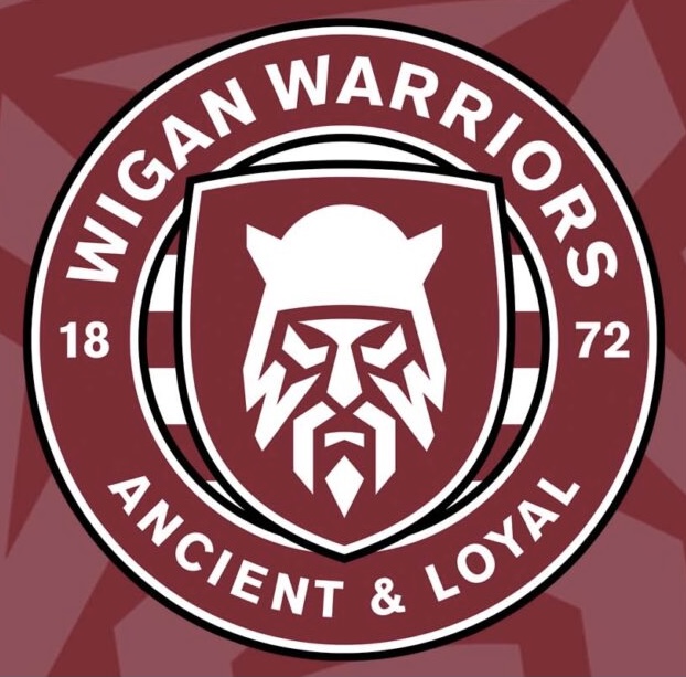
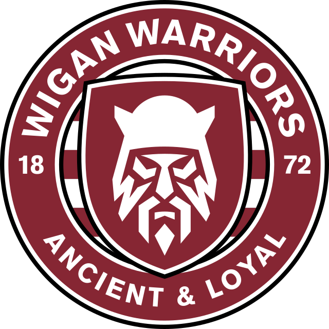
The badge has been designed to attract the younger generation, but the designer has put in the middle, a image of a old and sick looking Viking.
Perhaps a image of Mighty Max would been more appropriate!
|
|
|
| Rank | Posts | Team |
| Player Coach | 5193 | No
Team
Selected |
| Joined | Service | Reputation |
| Jan 2006 | 19 years | |
| Online | Last Post | Last Page |
| Aug 2024 | Mar 2024 | LINK |
| Milestone Posts |
|
| Milestone Years |
|
|
| Location |
|
| Signature |
|
TO BE FIXED |
|
| Quote ="Ruddy Duck"The badge has been designed to attract the younger generation, but the designer has put in the middle, a image of a old and sick looking Viking.
Perhaps a image of Mighty Max would been more appropriate!'"
The whole 'attract a younger generation' thing is tosh aswell, you accept the existing badge and grow to love it. I remember going home from Central Park as a kid and seeing the Wigan badge on a substation just past the police station heading towards Poolstock Lane. I grew up doodling that badge in the back of my school books.
For me, there is far too much change and change for change sake. We need a cherry and white hooped shirt every season, with little change, maybe add piping, or add a black collar, make the hoops 5mm wider, then the next year 5mm narrower and thats it. Experiment with the away shirt only, every 5 years and each other time have the same shirt as the home but blue instead of cherry.
Keep the badge but modernise it slightly. |
|
|
|
| Rank | Posts | Team |
| Club Coach | 18737 | No
Team
Selected |
| Joined | Service | Reputation |
| Jul 2005 | 20 years | |
| Online | Last Post | Last Page |
| Jan 2025 | May 2024 | LINK |
| Milestone Posts |
|
| Milestone Years |
|
|
| Location |
|
| Signature |
|
TO BE FIXED |
Moderator
|
| Quote ="post"Yes but in the current format just to see it modernised. Like your avatar but with the lions and king and that section slightly bigger.'"
The lions are too intricate. That's the issue with the current logo.
As you know i did some retro shirts, just over 10 years ago now, and the main issues with them were the detail in the logo. I thought at the time it was a little dated, particularly compared with the other teams in SL. The reasons for the change make absolute sense. I totally get the reasoning behind it. Digital media is the future., Apps on phones, social media.. Everything is online. the print industry is dying. Look at the wigan logo on a phone screen when it's small. It just turns to a blur of gold and red. The logo needs to be basic and work as a single colour or 2 colour block. Look at all the most successful brands in the world. Apple, Levis, Facebook, Adidas, Nike, Toyota, Pornhub, Starbucks... Even sports clubs like Man Utd, Barcelona, NBA, NFL... They're all simple and easily identifiable from a distance. Stick the current wigan crest on a photograph of a crowd scene and you'll lose it. Stick the new one on the same pic and it stands out. It can be reproduced in the 2 colour red and white or just done in white, red, black, green, blue.. It works.
I will add that I think a nod to the current logo would have been a good idea, whether that's the castle or the knights head, but I don't know how that would work with the warrior brand. |
|
|
| Rank | Posts | Team |
| Club Owner | 237 | No
Team
Selected |
| Joined | Service | Reputation |
| Oct 2003 | 21 years | |
| Online | Last Post | Last Page |
| Jan 2025 | Oct 2024 | LINK |
| Milestone Posts |
|
| Milestone Years |
|
|
| Location |
|
| Signature |
|
TO BE FIXED |
|
| Quote ="Pemps"The lions are too intricate. That's the issue with the current logo.
As you know i did some retro shirts, just over 10 years ago now, and the main issues with them were the detail in the logo. I thought at the time it was a little dated, particularly compared with the other teams in SL. The reasons for the change make absolute sense. I totally get the reasoning behind it. Digital media is the future., Apps on phones, social media.. Everything is online. the print industry is dying. Look at the wigan logo on a phone screen when it's small. It just turns to a blur of gold and red. The logo needs to be basic and work as a single colour or 2 colour block. Look at all the most successful brands in the world. Apple, Levis, Facebook, Adidas, Nike, Toyota, Pornhub, Starbucks... Even sports clubs like Man Utd, Barcelona, NBA, NFL... They're all simple and easily identifiable from a distance. Stick the current wigan crest on a photograph of a crowd scene and you'll lose it. Stick the new one on the same pic and it stands out. It can be reproduced in the 2 colour red and white or just done in white, red, black, green, blue.. It works.
I will add that I think a nod to the current logo would have been a good idea, whether that's the castle or the knights head, but I don't know how that would work with the warrior brand.'"
Great post and explanation. On the Facebook, Wigan Warriors Supporters Forum, a guy called Matt Baines has designed home and away shirts plus a new ‘logo style’ badge. The badge incorporates the two lions, a crown, the castle on a shield with the words Ancient & Loyal. Wigan Warriors is written underneath. Very impressive the designs are too. The only change I would make to the badge, would be to include 1872 as well.
The kits are the now usual darker shade of cherry with five thin white hoops and white trim on collar and cuffs. The away shirt is a direct opposite, being mainly white but with five thin cherry hoops and cherry trim on collar and cuffs. They must have been knocked up within an hour or so of the new stuff being leaked. The kits look ace and I would buy them without hesitation. I’ve tried to copy and paste them but it doesn’t seem to work.
I love our long standing club crest but I think Pemps is right and for the reasons he highlights. Folk of a certain age (me included) tend to resist change but I feel once folk see the lads wearing the new badge on the new kits and merchandise, it will grow. |
|
|
| Rank | Posts | Team |
| Player Coach | 3092 | No
Team
Selected |
| Joined | Service | Reputation |
| Feb 2006 | 19 years | |
| Online | Last Post | Last Page |
| Mar 2023 | Feb 2023 | LINK |
| Milestone Posts |
|
| Milestone Years |
|
|
| Location |
|
| Signature |
|
TO BE FIXED |
|
| Quote ="Pemps"
I will add that I think a nod to the current logo would have been a good idea, whether that's the castle or the knights head, but I don't know how that would work with the warrior brand.'"
You get rid of the warrior brand. It's a failed name which is not loved and not required when the place name tells you everything you need to know about the town, the club and what sport it is playing.
Not many, hopefully, are seriously suggesting there was no need for a badge update for all the reasons you state. But they've focussed on totally the wrong thing - the identity of the club is not the Warriors part, let's be honest nobody cares about that. The club is famous for being Wigan and Wigan is famous for Rugby League. |
|
|
|
| Rank | Posts | Team |
| Club Coach | 18737 | No
Team
Selected |
| Joined | Service | Reputation |
| Jul 2005 | 20 years | |
| Online | Last Post | Last Page |
| Jan 2025 | May 2024 | LINK |
| Milestone Posts |
|
| Milestone Years |
|
|
| Location |
|
| Signature |
|
TO BE FIXED |
Moderator
|
| Quote ="Darwen Warrior"Great post and explanation. On the Facebook, Wigan Warriors Supporters Forum, a guy called Matt Baines has designed home and away shirts plus a new ‘logo style’ badge. The badge incorporates the two lions, a crown, the castle on a shield with the words Ancient & Loyal. Wigan Warriors is written underneath. Very impressive the designs are too. The only change I would make to the badge, would be to include 1872 as well.'"
I've seen it, and it doesn't work. The Ancient & Loyal is too small and the lions are to intricate. whoever designed that hasn't listened to the brief at all.
I'm not a fan of the home kit but the away one looks decent, if a little like a retro Manly kit.
With regards to the new kit that we've seen sneak previews of... Swap the black and red around and it makes a great away kit. |
|
|
| Rank | Posts | Team |
| Club Coach | 18737 | No
Team
Selected |
| Joined | Service | Reputation |
| Jul 2005 | 20 years | |
| Online | Last Post | Last Page |
| Jan 2025 | May 2024 | LINK |
| Milestone Posts |
|
| Milestone Years |
|
|
| Location |
|
| Signature |
|
TO BE FIXED |
Moderator
|
| Quote ="The Ghost of '99"You get rid of the warrior brand. It's a failed name which is not loved and not required when the place name tells you everything you need to know about the town, the club and what sport it is playing.
Not many, hopefully, are seriously suggesting there was no need for a badge update for all the reasons you state. But they've focussed on totally the wrong thing - the identity of the club is not the Warriors part, let's be honest nobody cares about that. The club is famous for being Wigan and Wigan is famous for Rugby League.'"
I'm not a huge fan of the warriors name, but I'm nearly 50. I suppose I'm not that d to kick up a fuss about it either. I have far better things to worry about. My god son is 14 and refers to us as the Warriors. Kids loved Max the warrior. It's here to stay. |
|
|
| Rank | Posts | Team |
| Player Coach | 3019 | No
Team
Selected |
| Joined | Service | Reputation |
| Feb 2010 | 15 years | |
| Online | Last Post | Last Page |
| Feb 2025 | Feb 2025 | LINK |
| Milestone Posts |
|
| Milestone Years |
|
|
| Location |
|
| Signature |
|
TO BE FIXED |
|
| Quote ="Darwen Warrior"Great post and explanation. On the Facebook, Wigan Warriors Supporters Forum, a guy called Matt Baines has designed home and away shirts plus a new ‘logo style’ badge. The badge incorporates the two lions, a crown, the castle on a shield with the words Ancient & Loyal. Wigan Warriors is written underneath. Very impressive the designs are too. The only change I would make to the badge, would be to include 1872 as well.
The kits are the now usual darker shade of cherry with five thin white hoops and white trim on collar and cuffs. The away shirt is a direct opposite, being mainly white but with five thin cherry hoops and cherry trim on collar and cuffs. They must have been knocked up within an hour or so of the new stuff being leaked. The kits look ace and I would buy them without hesitation. I’ve tried to copy and paste them but it doesn’t seem to work.
I love our long standing club crest but I think Pemps is right and for the reasons he highlights. Folk of a certain age (me included) tend to resist change but I feel once folk see the lads wearing the new badge on the new kits and merchandise, it will grow.'"
On the same page I've posted pics of Boston and Ashton in kits with no badge at all.
I can understand people not liking the new badge but it's not as if 150 years of tradition has been trampled on. |
|
|
|
| Rank | Posts | Team |
| Player Coach | 5193 | No
Team
Selected |
| Joined | Service | Reputation |
| Jan 2006 | 19 years | |
| Online | Last Post | Last Page |
| Aug 2024 | Mar 2024 | LINK |
| Milestone Posts |
|
| Milestone Years |
|
|
| Location |
|
| Signature |
|
TO BE FIXED |
|
| Quote ="Darwen Warrior"Great post and explanation. On the Facebook, Wigan Warriors Supporters Forum, a guy called Matt Baines has designed home and away shirts plus a new ‘logo style’ badge. The badge incorporates the two lions, a crown, the castle on a shield with the words Ancient & Loyal. Wigan Warriors is written underneath. Very impressive the designs are too. The only change I would make to the badge, would be to include 1872 as well.
The kits are the now usual darker shade of cherry with five thin white hoops and white trim on collar and cuffs. The away shirt is a direct opposite, being mainly white but with five thin cherry hoops and cherry trim on collar and cuffs. They must have been knocked up within an hour or so of the new stuff being leaked. The kits look ace and I would buy them without hesitation. I’ve tried to copy and paste them but it doesn’t seem to work.
I love our long standing club crest but I think Pemps is right and for the reasons he highlights. Folk of a certain age (me included) tend to resist change but I feel once folk see the lads wearing the new badge on the new kits and merchandise, it will grow.'"
Can you put a picture of said badge and kits please? |
|
|
| Rank | Posts | Team |
| Player Coach | 5193 | No
Team
Selected |
| Joined | Service | Reputation |
| Jan 2006 | 19 years | |
| Online | Last Post | Last Page |
| Aug 2024 | Mar 2024 | LINK |
| Milestone Posts |
|
| Milestone Years |
|
|
| Location |
|
| Signature |
|
TO BE FIXED |
|
| Quote ="Pemps"The lions are too intricate. That's the issue with the current logo.
As you know i did some retro shirts, just over 10 years ago now, and the main issues with them were the detail in the logo. I thought at the time it was a little dated, particularly compared with the other teams in SL. The reasons for the change make absolute sense. I totally get the reasoning behind it. Digital media is the future., Apps on phones, social media.. Everything is online. the print industry is dying. Look at the wigan logo on a phone screen when it's small. It just turns to a blur of gold and red. The logo needs to be basic and work as a single colour or 2 colour block. Look at all the most successful brands in the world. Apple, Levis, Facebook, Adidas, Nike, Toyota, Pornhub, Starbucks... Even sports clubs like Man Utd, Barcelona, NBA, NFL... They're all simple and easily identifiable from a distance. Stick the current wigan crest on a photograph of a crowd scene and you'll lose it. Stick the new one on the same pic and it stands out. It can be reproduced in the 2 colour red and white or just done in white, red, black, green, blue.. It works.
I will add that I think a nod to the current logo would have been a good idea, whether that's the castle or the knights head, but I don't know how that would work with the warrior brand.'"
I do understand that the embroidery would be difficult on a shirt, Ive had badges warp after months/years of washing but also on some of the kits when they were iron on badges they peeled off. There must a happy medium, we don't need to throw the baby out with the bath water.
Also Pemps, you are a clever bloke who gets what they want and also good at design. I'm almost certain you could come up with 5 designs for a badge that would be better and we could poll on? (Hint hint, wink wink). |
|
|
| Rank | Posts | Team |
| Club Coach | 15821 | No
Team
Selected |
| Joined | Service | Reputation |
| Jun 2005 | 20 years | |
| Online | Last Post | Last Page |
| Feb 2025 | Feb 2025 | LINK |
| Milestone Posts |
|
| Milestone Years |
|
|
| Location |
|
| Signature |
|
TO BE FIXED |
|
| Quote ="post"I do understand that the embroidery would be difficult on a shirt, Ive had badges warp after months/years of washing but also on some of the kits when they were iron on badges they peeled off. There must a happy medium, we don't need to throw the baby out with the bath water.
Also Pemps, you are a clever bloke who gets what they want and also good at design. I'm almost certain you could come up with 5 designs for a badge that would be better and we could poll on? (Hint hint, wink wink).'"
*cough*Pirtek*cough*
 |
|
|
| Rank | Posts | Team |
| International Star | 4470 | No
Team
Selected |
| Joined | Service | Reputation |
| Jan 2013 | 12 years | |
| Online | Last Post | Last Page |
| Oct 2024 | Oct 2024 | LINK |
| Milestone Posts |
|
| Milestone Years |
|
|
| Location |
|
| Signature |
|
TO BE FIXED |
|
| Quote ="Pemps"I've seen it, and it doesn't work. The Ancient & Loyal is too small and the lions are to intricate. whoever designed that hasn't listened to the brief at all.
I'm not a fan of the home kit but the away one looks decent, if a little like a retro Manly kit.
With regards to the new kit that we've seen sneak previews of... Swap the black and red around and it makes a great away kit.'"
Could we not make something similar to the GB crest which was almost like a rubber transfer. Stands out a mile. |
|
|
| Rank | Posts | Team |
| Player Coach | 5515 | No
Team
Selected |
| Joined | Service | Reputation |
| Nov 2006 | 18 years | |
| Online | Last Post | Last Page |
| Feb 2025 | Jan 2025 | LINK |
| Milestone Posts |
|
| Milestone Years |
|
|
| Location |
|
| Signature |
|
TO BE FIXED |
|
| Quote ="Pemps"I'm not a huge fan of the warriors name, but I'm nearly 50. I suppose I'm not that d to kick up a fuss about it either. I have far better things to worry about. My god son is 14 and refers to us as the Warriors. Kids loved Max the warrior. It's here to stay.'"
I have to say that those who feel the Warriors part of the name has failed are living in their own bubble (topical reference for you there!) I know from introducing my son to the club that supporters new to the game tend to refer to the club by using the Warriors epithet just as much as they do the Wigan part. |
|
|
| Rank | Posts | Team |
| Club Owner | 237 | No
Team
Selected |
| Joined | Service | Reputation |
| Oct 2003 | 21 years | |
| Online | Last Post | Last Page |
| Jan 2025 | Oct 2024 | LINK |
| Milestone Posts |
|
| Milestone Years |
|
|
| Location |
|
| Signature |
|
TO BE FIXED |
|
|
|
|
|
| Rank | Posts | Team |
| Player Coach | 5515 | No
Team
Selected |
| Joined | Service | Reputation |
| Nov 2006 | 18 years | |
| Online | Last Post | Last Page |
| Feb 2025 | Jan 2025 | LINK |
| Milestone Posts |
|
| Milestone Years |
|
|
| Location |
|
| Signature |
|
TO BE FIXED |
|
| Quote ="Darwen Warrior"https://facebook.com/matthainessport/posts/1291436104582552'"
It's huge!! |
|
|
| Rank | Posts | Team |
| Club Owner | 237 | No
Team
Selected |
| Joined | Service | Reputation |
| Oct 2003 | 21 years | |
| Online | Last Post | Last Page |
| Jan 2025 | Oct 2024 | LINK |
| Milestone Posts |
|
| Milestone Years |
|
|
| Location |
|
| Signature |
|
TO BE FIXED |
|
| Quote ="Pemps"I've seen it, and it doesn't work. The Ancient & Loyal is too small and the lions are to intricate. whoever designed that hasn't listened to the brief at all.
'"
Fair enough. I don’t think he was paying too much attention to the brief, to be honest. Think he was just doing it for his own amusement more than anything, although he does state somewhere that he has done designs for other clubs. |
|
|
| Rank | Posts | Team |
| Club Owner | 237 | No
Team
Selected |
| Joined | Service | Reputation |
| Oct 2003 | 21 years | |
| Online | Last Post | Last Page |
| Jan 2025 | Oct 2024 | LINK |
| Milestone Posts |
|
| Milestone Years |
|
|
| Location |
|
| Signature |
|
TO BE FIXED |
|
| Quote ="Phuzzy"It's huge!!'"
Haha, yeah as big as some sponsors! |
|
|
| Rank | Posts | Team |
| Player Coach | 2996 | No
Team
Selected |
| Joined | Service | Reputation |
| Jul 2008 | 17 years | |
| Online | Last Post | Last Page |
| Jan 2025 | Feb 2025 | LINK |
| Milestone Posts |
|
| Milestone Years |
|
|
| Location |
|
| Signature |
|
TO BE FIXED |
|
| Quote ="NickyKiss"Lenagan has got some things wrong for sure but my word he’s got more right and a lot of his decisions have been spectacularly right. I believe he’s an absolute legend of this club and I shudder to think where we could’ve been without him. It doesn’t mean you back every call he makes regardless of you being in favour or not but he deserves masses of respect.
The club we support today compared to the one he took over is chalk and cheese. I’m not chuffed with the badge but they’ve rebuilt a lot of our tradition and have constantly pushed our heritage in various ways. The pushing of the youth system gives everyone great pride. To see so many players come through and debut in his time has been my biggest highlight.
In short, I’ll forgive him for changing our badge and see how it plays out.'"
I've been thinking quite extensively about this since the weekend and on reflection its not the change that saddens me anymore its more about the execution of the product and an awareness that this was really a momentous decision..
I knew that the change was coming - Ive been aware for it for months. If I'm honest I'd forgotten it was "still on the go".
On reflection for me personally I shouldn't have watched the heritage video which I loved because I'm in my element embellished in club nostalgia. I think one or two people criticised the technical quality of the product which I couldn't even start to comment on but I thought the content and ethos was first class. I never give 10 out of 10 but I'd give it a strong 9. The emotion of all the history and what defines Wigan ending with a badge that looked like a blob of red was a bit of a roller coaster.
I don't like the new badge. Its too cluttered, too much cherry red, too bland, too much like a plethora of other badges and for me looks amateurish. There's nothing special or unique about it other than we have a "Warrior" who I don't think anyone has given any positive feedback on either on here or other social media outlets. It doesn't matter what I think and I'm fully aware of that and have zero issues or problems with those who like and embrace it. I haven't seen or heard of people embracing the new badge but maybe that will come with time. In terms of uniqueness I suspect that this doesn't really matter at the moment but for me if we are making such major changes I would have preferred
I'm still unsure as to the major reason for the change.
Was it predominantly SL or Sky TV pressure?
The cost of production piece I can sort of understand to a degree. Poor quality of the A&L on various platforms has zero impact on me personally but can to a degree understand this argument. To these 2 arguments I could argue the New Zealand Siver Fearn probably has the same issues but the chances of the All Blacks jettisoning this iconic symbol is less than zero.
A combination of the above and perhaps the need to reboot the brand is where I think we are but still unsure. If I'm interpreting it correctly then the brand is The Warriors but unsure what Ancient & Loyal represents on the badge?
I placated myself in that they will bring back A&L in 2022 which I think somewhere I have seen there will be some sort of heritage game where the A&L badge will be used. Although I've been pontificating and stating categorically that this will not maybe but will occur I now think that this would be wrong.
In the last day or so I have come to the conclusion that If we are to go through this pain and for me when the penny finally dropped that the Ancient & Loyal has been consigned to history I felt a little surreal so for me it is pain albeit not in a physical sense, then let's do this thoroughly and not half heartedly.
In the video where KR went through the rationale for the change and the process involved at one point he stated that IL wanted to be more bold and now I've thought it through IL is probably right. He will be fully aware of the pain and cost and probably thinks if we are going to do this then lets do once and get it done with. I think the problem is that with the new badge it wont be once and I think that it will quickly be refreshed as quickly as conscience will allow. In the future I suspect we will drop the Ancient & Loyal (in hindsight should not have been retained) and revamp the "Warrior".
I thought that KR was very good in the videos and certainly from a presentational point of view he is growing into his role admirably. Obviously a well rehed piece but still delivered with great professionalism.
For me if this rebrand it to work we need to stop looking backwards and continually look forward. Mixed message of Ancient & Loyal and Warriors to me just doesn't work and gives a confusing message.We need to stop referring to The Wigan Way and use The Warrior Way. All press briefings need to refer to The Warriors. If we really believe in The Warriors then the use of Wigan as the feature on the majority if not all marketing should be dropped. We should be advising Sky that during commentaries and any news updates then we should be referred to as The Warriors.
City, United, 49'rs, Jets, The Storm, The Broncos, Raiders, Chiefs...…. The Warriors
I suspect that if we do not do this then we will have had the heartache of major fundamental changes without the expected/targeted benefits. |
|
|
| Rank | Posts | Team |
| Club Coach | 7439 | No
Team
Selected |
| Joined | Service | Reputation |
| Feb 2005 | 20 years | |
| Online | Last Post | Last Page |
| Oct 2024 | Oct 2024 | LINK |
| Milestone Posts |
|
| Milestone Years |
|
|
| Location |
|
| Signature |
|
TO BE FIXED |
|
|
Do I like the badge? No
Will it stop me buying club products? No
Stop me going to games? No
Can I get used to it? Yes
That’s what it boils down to. We all knew, as much as we’d rather not, that the club crest wasn’t going to last as was forever. To be a success a business has to be adapting constantly which is what we have done. I’m all for nostalgia and tradition, in certain aspects of my life (work especially) I’m murder for it. I much prefer the badge designed with the castle and crown in the middle and would rather we drop the “Warriors” tag and roll with “Wigan RLFC”.
But we’ve had it for over 20yrs now. There’s fans of ours of an adult age who’s never known us as anything else who’s feel just as strongly as we do on the opposing side. We’re all not going to be here in 70/80years time (I hope we are!) and to ensure our club is we’ve got to keep moving forward.
I trust IL and KR to make decisions that benefit the club, they’ve had far more right than they have wrong. Look back to where we were before with Uncle Mo and DW and it’s worlds apart. We’ve shored up and made solid foundations to build the club on, consistently competitive on and off the pitch and attract the worlds finest players.
I don’t like the badge. But I love my club and the direction it’s going on, I’m going along with it.
|
|
|
| Rank | Posts | Team |
| Player Coach | 5515 | No
Team
Selected |
| Joined | Service | Reputation |
| Nov 2006 | 18 years | |
| Online | Last Post | Last Page |
| Feb 2025 | Jan 2025 | LINK |
| Milestone Posts |
|
| Milestone Years |
|
|
| Location |
|
| Signature |
|
TO BE FIXED |
|
|
As 100% says above, I'm more interested in the club than the badge. I sort of wish they'd gone about it by engaging the fans more in the first instance but it's not the be all and end all. Pity it overshadowed the derby win and the French signing though.
|
|
|
| Rank | Posts | Team |
| Player Coach | 5193 | No
Team
Selected |
| Joined | Service | Reputation |
| Jan 2006 | 19 years | |
| Online | Last Post | Last Page |
| Aug 2024 | Mar 2024 | LINK |
| Milestone Posts |
|
| Milestone Years |
|
|
| Location |
|
| Signature |
|
TO BE FIXED |
|
| Quote ="100% Warrior"Do I like the badge? No
Will it stop me buying club products? No
Stop me going to games? No
Can I get used to it? Yes
That’s what it boils down to. We all knew, as much as we’d rather not, that the club crest wasn’t going to last as was forever. To be a success a business has to be adapting constantly which is what we have done. I’m all for nostalgia and tradition, in certain aspects of my life (work especially) I’m murder for it. I much prefer the badge designed with the castle and crown in the middle and would rather we drop the “Warriors” tag and roll with “Wigan RLFC”.
But we’ve had it for over 20yrs now. There’s fans of ours of an adult age who’s never known us as anything else who’s feel just as strongly as we do on the opposing side. We’re all not going to be here in 70/80years time (I hope we are!) and to ensure our club is we’ve got to keep moving forward.
I trust IL and KR to make decisions that benefit the club, they’ve had far more right than they have wrong. Look back to where we were before with Uncle Mo and DW and it’s worlds apart. We’ve shored up and made solid foundations to build the club on, consistently competitive on and off the pitch and attract the worlds finest players.
I don’t like the badge. But I love my club and the direction it’s going on, I’m going along with it.'"
Yes businesses need to change with the times, but not change for change sake and not change things that don't need changing. I don't like the Warriors tag but its been around long enough now and Im ok with it. A modernisation of the badge would be fine as a sideline, to run alongside the proper badge but this particular badge is naff at best. |
|
|
| Rank | Posts | Team |
| Club Coach | 7439 | No
Team
Selected |
| Joined | Service | Reputation |
| Feb 2005 | 20 years | |
| Online | Last Post | Last Page |
| Oct 2024 | Oct 2024 | LINK |
| Milestone Posts |
|
| Milestone Years |
|
|
| Location |
|
| Signature |
|
TO BE FIXED |
|
| Quote ="post"Yes businesses need to change with the times, but not change for change sake and not change things that don't need changing. I don't like the Warriors tag but its been around long enough now and Im ok with it. A modernisation of the badge would be fine as a sideline, to run alongside the proper badge but this particular badge is naff at best.'"
The thing is I don’t disagree, you certainly won’t see me cheering it. It could have been done better or had more of a fan involvement but it’s done and dusted. We all now need to move on. It’s a huge week for the club and some rather unexpected silverware on offer (even if it’s just the hub cap). This week and coming weeks are huge for us as a club, for one the results will dictate Lam’s fate. |
|
|
|
|
|